Asakiri - Language learning platform
/ 5 min read
Updated:Table of Contents
Asakiri: Reimagining Community-Driven Language Learning

The Challenge Space
When I began work on Asakiri, I identified a fundamental tension in language learning platforms. Educational research consistently shows that authentic human interaction is essential for language acquisition, yet most platforms rely on rigid lessons and computer-generated exercises.
The core insight driving my design was simple but powerful: communities hold vast untapped knowledge, but the tools to share language expertise remain inaccessible to many teachers who aren’t professional content creators.
Design Research: Beyond Conventional Wisdom

My initial assumptions were challenged when I conducted contextual inquiries with 27 language learners and 12 teachers across 5 countries. Three surprising patterns emerged:
-
Content creation anxiety: Teachers expressed far more concern about content organization than content creation itself. “I know what to teach, but not how to structure it digitally,” was a recurring sentiment.
-
Learning-teaching fluidity: 63% of language learners also taught or wanted to teach aspects of their native language. The traditional binary of “learner” versus “teacher” was artificially limiting.
-
Meta-language barriers: Non-native English speakers struggled with learning platforms that required English navigation even when learning content was in their target language.
Key Design Principles
These insights led me to define four guiding principles that would direct my UX and frontend development work:
-
Gradual complexity exposure: Interfaces should appear simple initially but reveal complexity as users develop confidence.
-
Bidirectional roles: The system should respect that users can be both learners and teachers, sometimes simultaneously.
-
Language-independent workflows: Interface interactions should rely on visual patterns and consistency rather than language comprehension.
-
Community visibility: Make the human aspects of the community visible throughout the experience.
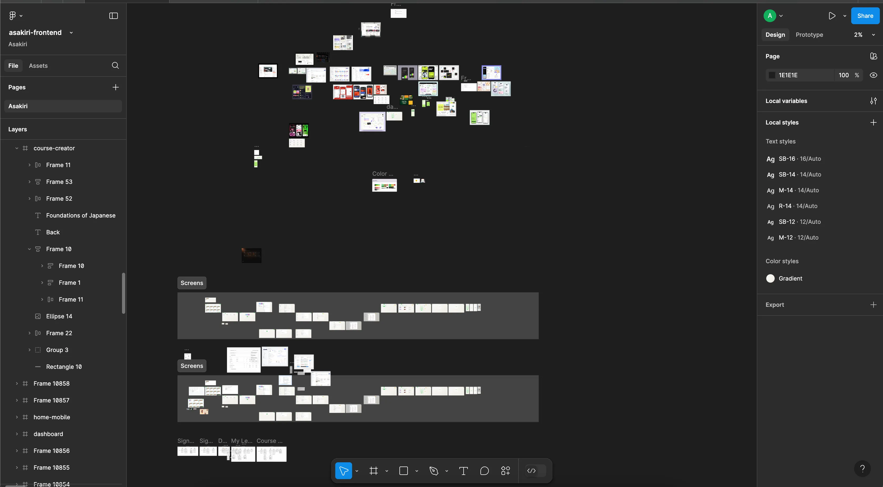
The Interface Evolution
Prototype 1: “Structured Content Editor”
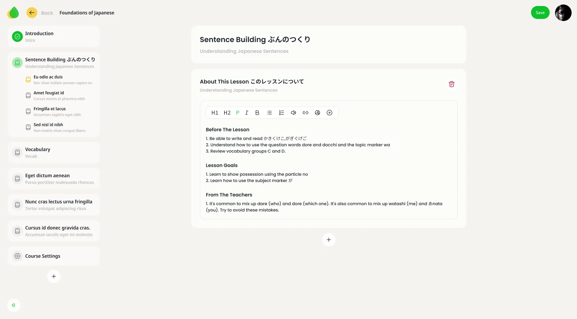
My first approach focused on building a sophisticated content editor with predefined templates. After implementing the basic component structure in React, user testing revealed a critical flaw: teachers felt constrained rather than enabled by the structure.
“I feel like I’m filling out a form, not creating a course.” —Language teacher, feedback session
Prototype 2: “Freeform with Guardrails”
I pivoted to a more open-ended editor where teachers could start with blank modules but access organizational tools as needed. This approach resonated with teachers but created inconsistent experiences for learners.
Prototype 3: “Hybrid Framework”


My successful approach ultimately combined:
- A visual chapter/section hierarchy that remains consistent across courses
- Freeform content creation within sections
- Contextual organization tools that appear when needed
The Core Interaction Model
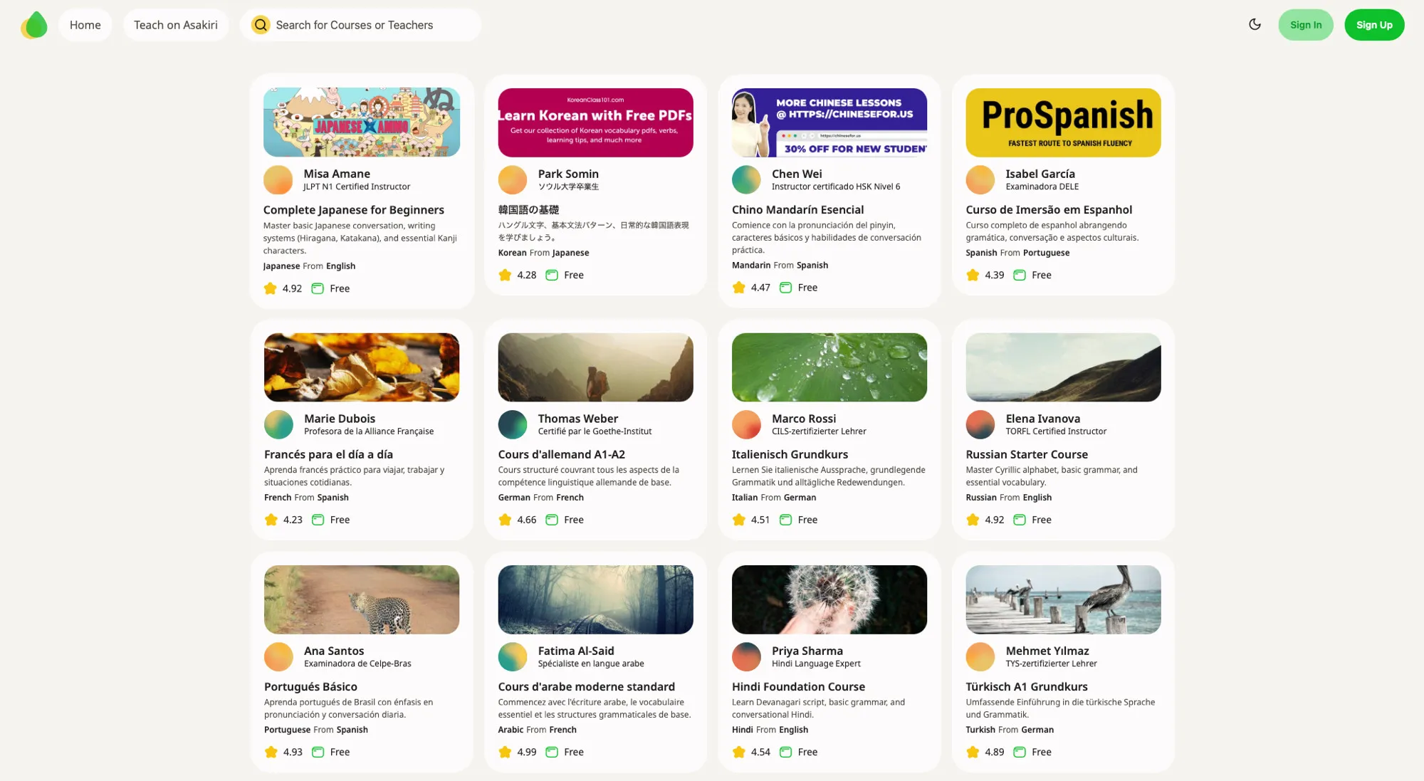
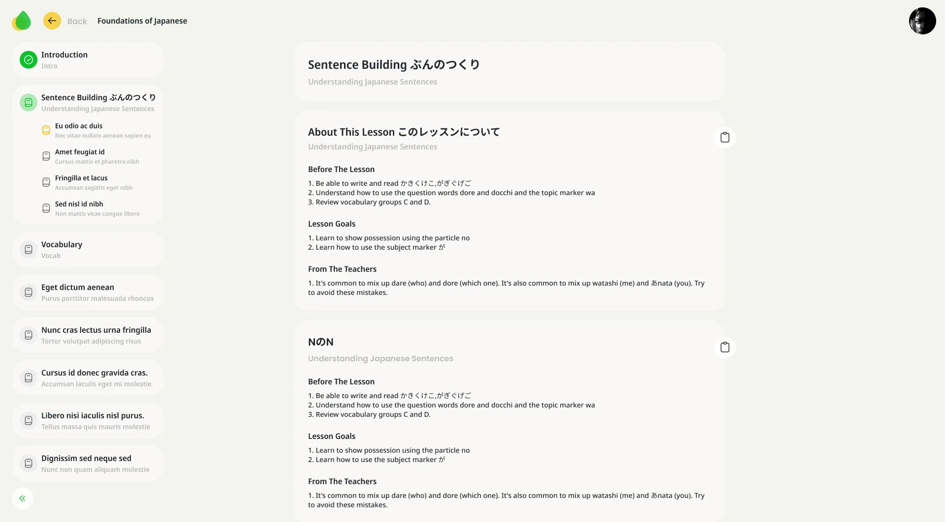
The breakthrough came when I redefined the core interaction model around content “cards” as the atomic unit of both creation and consumption:
Card > Section > Chapter > CourseThis modular approach solved several problems simultaneously:
- Teachers could focus on creating manageable content chunks without getting overwhelmed by the entire course structure
- Learners gained consistent, predictable navigation patterns across different courses
- The visual card metaphor reduced reliance on language for understanding structure
Frontend Implementation: Color System as Communication
When developing the frontend, I designed the color system to serve specific communicative functions rather than just aesthetic purposes:
- Primary green: Action and progress elements
- Secondary yellow: Highlighting and emphasis
- Surface variations: Information hierarchy and spatial delineation
- Error red: Reserved strictly for validation issues and alerts
This functional approach to color allows users from different cultural backgrounds to understand interface patterns regardless of language.
Responsive Patterns: Adapting to Constraints
My responsive approach for Asakiri rejected the conventional “mobile-first” mantra in favor of “content-first” thinking. I built the content card as the foundational element that maintained its integrity across devices, while navigation patterns adapted to screen constraints:
- Desktop: Persistent sidebar navigation with visible hierarchy
- Tablet: Collapsible sidebar with tap-to-expand chapters
- Mobile: Bottom sheet navigation with section previews
This respects the central importance of content while acknowledging the changing context of use across devices.
Typography: Readability Across Languages
When implementing the typography system, I needed it to serve multiple functions:
- Support various writing systems including Latin, Cyrillic, and CJK characters
- Maintain readability at different text densities
- Create clear hierarchies regardless of language
I chose Noto Sans as the foundation due to its exceptional language support, supplemented with a robust scale of sizes and weights to maintain hierarchy.
Usability Insights: The Unexpected Patterns
Testing across diverse user groups revealed unexpected insights that shaped my final implementation:
-
Navigation Preference Inversion: Beginners preferred chronological navigation through content, while advanced users sought topic-based navigation—the opposite of my initial hypothesis.
-
Editor Mode Attachment: Teachers frequently wanted to switch to “student view” to verify content presentation, suggesting a need for fluid role-switching.
-
Guidance-Independence Spectrum: Users with technical backgrounds wanted to “skip the tutorial,” while others needed persistent guidance—leading to my approach of embedding help within context rather than as separate tutorials.
The Technical Dance: Balancing UX and Frontend Development
As the sole frontend developer, my implementation in React with TypeScript and SCSS created several technical challenges:
- Rich Text Challenges: My TipTap editor integration required custom extensions to support language-specific content
- Component Modularity: I designed the component system to balance consistency with flexibility
- Authentication and Role Management: Supporting fluid role-switching created authentication complexity
These technical realities forced design compromises that improved rather than harmed the experience, such as:
- Using distinct routes rather than tab interfaces for major mode changes
- Implementing optimistic UI updates with rollback patterns for content saving
- Leveraging persistent local storage to prevent content loss
Lessons Beyond Language Learning
My work on Asakiri yielded insights applicable beyond language education:
-
Design for role fluidity: Many digital products artificially restrict users to singular roles when real-world behavior is more dynamic.
-
Content-centered navigation: When structure serves content rather than vice versa, information hierarchies become more intuitive.
-
Gradual complexity exposure: Features revealed in context of need reduce cognitive load more effectively than comprehensive onboarding.
-
Cultural versus functional patterns: Design elements that communicate function through affordance rather than convention create more inclusive experiences.
Looking Forward
My roadmap for Asakiri continues to focus on reducing barriers between learning and teaching. Upcoming experiments include:
- Collaborative editing for team-taught courses
- Component-level feedback for inline course improvement
- Linear vs. exploratory learning path options
- Media-rich assessments beyond traditional quizzes
This project demonstrates that community-driven educational platforms benefit most not from novel features, but from thoughtful reconsideration of fundamental interaction patterns.