Matter
Social Journaling and Peer Support
Mental Health
B2C
Role
Product Designer, Builder
Timeline
3.5 Years
team
me
platform
Mobile
The Real Problem
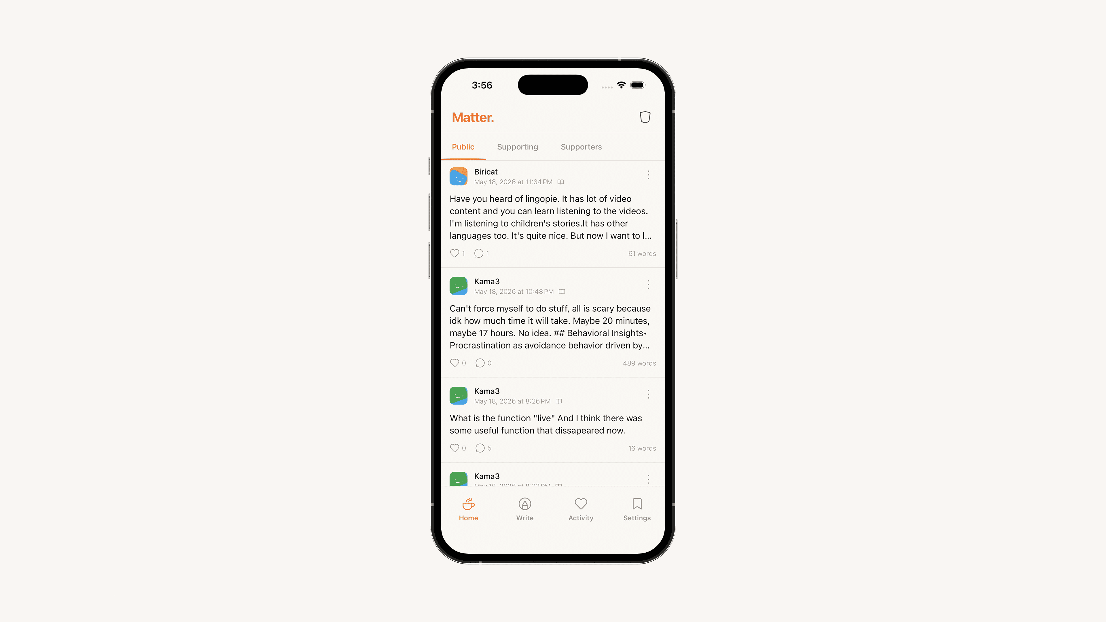
I opened a journaling app one evening to write something down and realized I was performing. There was a streak to protect, a tidy stat screen, a gentle nudge to share. The relief of just putting words on a page had quietly been replaced by a small, ambient pressure to keep an app happy.
That's the trap most of these products fall into. Social apps treat your writing as fuel — content to be distributed, optimized for reach, fed to an algorithm. Journaling apps treat it as data, locked in a silo with no human on the other side and a subscription wall in front of it. Neither lets you do the simple thing: write for yourself first, and share on your own terms only if you want to.
The deeper flaw is architectural. In almost every app I looked at, sharing is the default and privacy is a setting buried three screens deep. The product is built around the feed, and the entry is just the thing that feeds it. I wanted to invert that completely — make the private entry the center of gravity, and make an audience the exception you opt into, one entry at a time
Finding the Fix
The core decision was to separate the act of writing from the act of sharing, and to make that separation structural rather than cosmetic.
Three choices fell out of that:
Privacy is a first-class property of every entry. Not an account preference — a control you touch every time you write. When you finish an entry you pick its reach: private, mutuals only, following only, a specific circle, or public. The default is always private. The privacy selector ended up being the single most important piece of UI in the app, so it had to feel light, obvious, and impossible to get wrong.
The feed is deliberately small and slow. No recommendations, no algorithmic ranking, no infinite-scroll mechanics designed to keep you there. The home screen is organized as a few honest views — your own journal, the people you follow, your circles, the public feed — and that's it. The constraint is the feature.
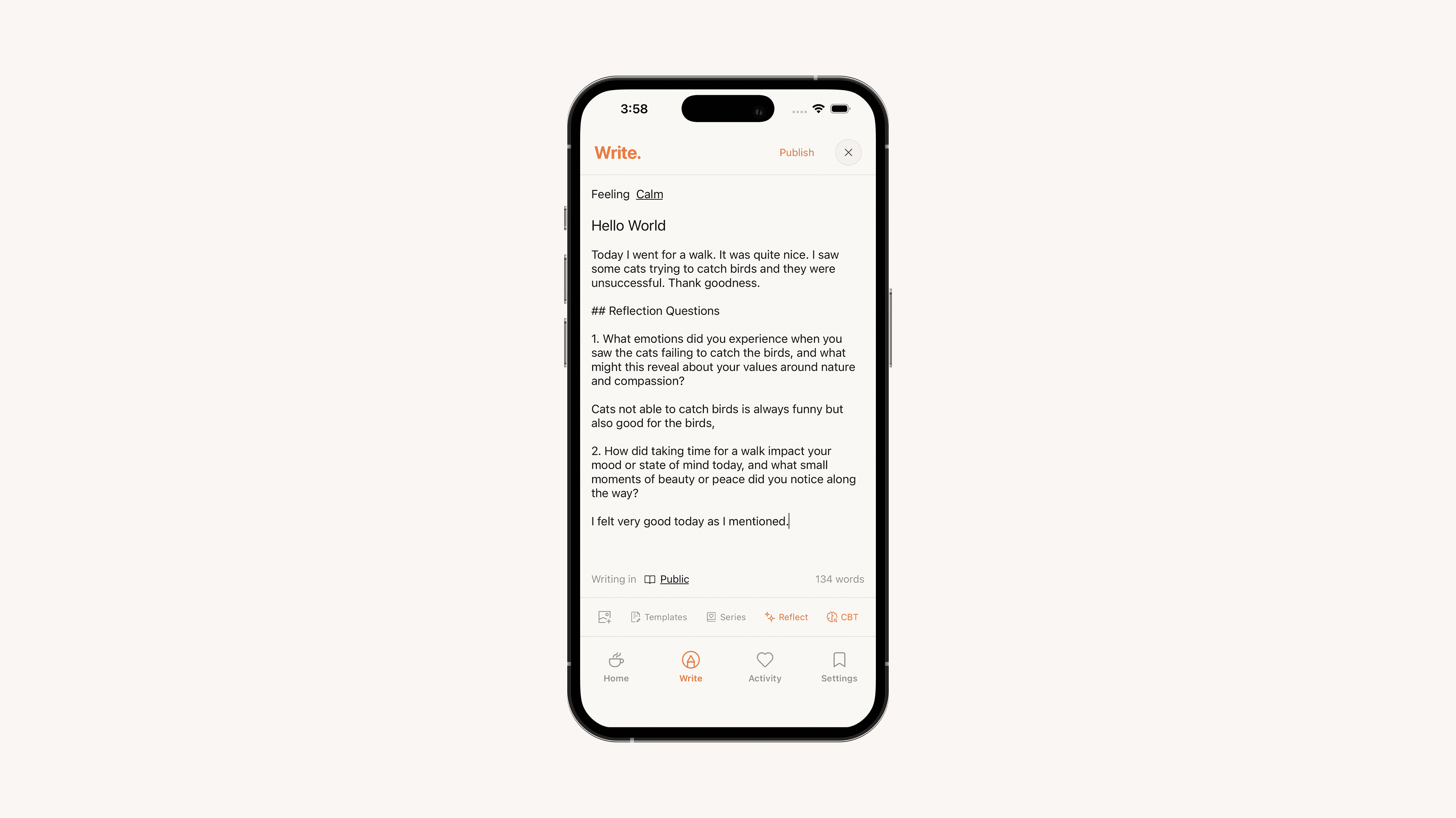
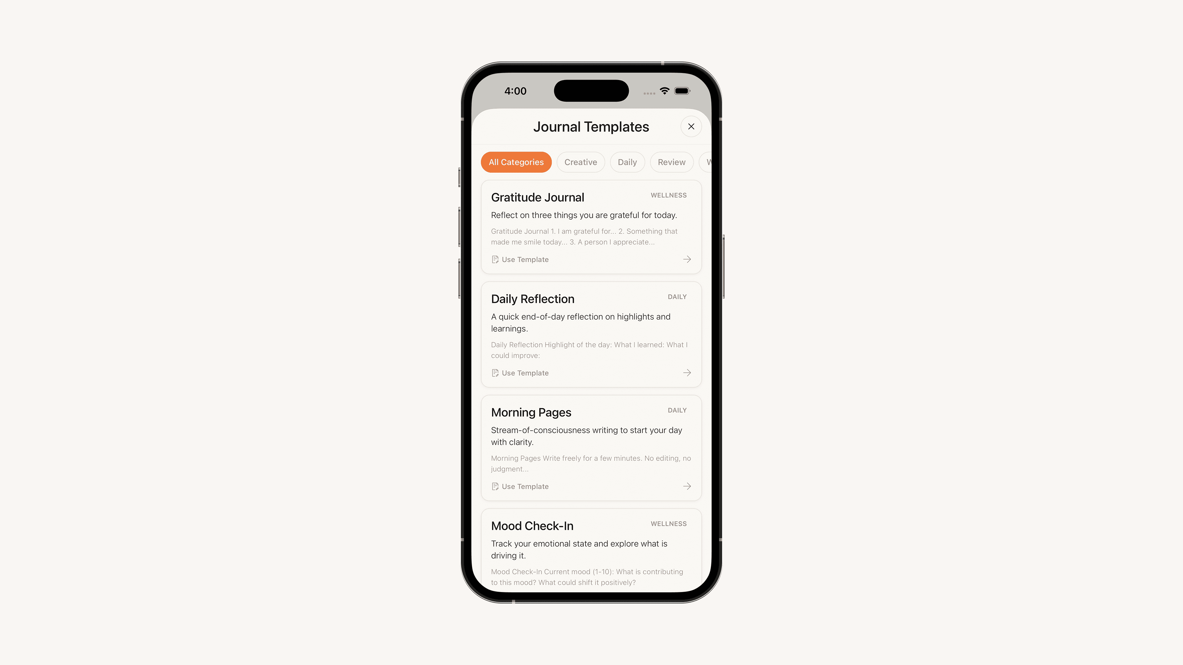
AI only shows up when summoned. I wanted reflection prompts and CBT-style nudges available for the moments you're stuck, but never pushed at you. Nothing analyzes your writing in the background. You ask, it answers, it leaves.
To protect the tone while the community was small, I made it invite-only: people request access from inside the app, an admin reviews, and they get an email when they're approved.
What Actually Happened
The plan survived contact with reality, but several specific bets did not — and the cuts taught me more than the things that worked.
I built a live AI co-writing mode, then pulled it within days. It was the most technically interesting thing I made and the most wrong. The moment AI started writing with you in real time, the private act turned into a conversation with a machine, and the quietness — the entire point — evaporated. I shipped it, sat with it, and ripped it out almost immediately, restoring plain image attachments in its place. Keeping AI strictly on-demand wasn't a constraint I imposed up front; it was one I learned by violating it.
I added a habits tracker, then removed it. It seemed adjacent to journaling. It wasn't. It quietly dragged the app toward being a productivity tool — streaks, checkboxes, the exact ambient pressure I was trying to escape. Cutting it brought the product back to its premise.
The access model loosened in stages. I started strictly invite-only with admin-reviewed requests. Over time that gate was too tight to grow at all, so I opened signup — but kept the riskiest surface, public photo posting, behind admin approval. The lesson was to put the gate where the actual risk lives (moderation of public content), not on the front door.
I rebuilt the architecture mid-project. As features piled up, the codebase started to tangle. I stopped and migrated the whole frontend to a strict feature-isolated structure — each feature owning its own components, hooks, and data, with a thin routing layer on top — so the app could keep growing without turning to mud. It paid for itself within weeks.
What Changed
What shipped is quieter and smaller than what I first imagined, and that's the point.
The biggest shift was realizing the feed was never the product — the private notebook was. I'd assumed people would come for the small social layer. In practice the gravity is the writing itself, and the social part is something you reach for occasionally and deliberately. So the app leads with your journal, not other people's.
The second shift was about AI. I assumed people wanted help writing. They didn't. They wanted AI to stay out of the way and appear only when invited — and to never touch their words otherwise. Every AI feature in the final app is something you summon, never something that summons you.
And the language around it changed. The product stopped being "an app I post on" and became "where I write." That's the sentence I was actually building toward.
What I'd Do Differently
Kill the live-AI experiment far sooner — or never start it. I knew on day two it fought the premise. I spent real time building it anyway because it was fun to make. Conviction about the premise should have overruled curiosity about the feature.
Decide the access model up front. Oscillating between invite-only and open cost me churn in the auth flow, the marketing site, and the moderation tooling. The right answer — open door, gated posting — was knowable from the start if I'd reasoned about where the risk lives instead of how exclusive it should feel.
Do the architecture work before piling on features, not halfway through. The migration was worth it, but it would have been cheaper and less disruptive if I'd set the structure before the app got messy.
What I Learned
Constraints are the product. Slow, small, no recommendations, private by default — these aren't limitations on Matter, they're the entire reason it exists. The hardest design work was protecting them from my own feature ideas.
Privacy is an architecture decision, not a settings screen. Making "who sees this" a per-entry, default-private property — rather than an account toggle — changed how the whole app is shaped, and it's the thing that makes Matter feel different to use.
AI earns its place only by being optional. The same feature can be calming or invasive depending entirely on whether the user asked for it. On-demand was the whole difference.
Building solo, the hardest discipline is deletion. Almost everything I'm proud of in the final product is something I removed. Knowing when to cut what you've already built — the habits tracker, the live AI, the over-strict gate — mattered more than anything I added.