Ikoi
A todo app for ADHD brains, architected to work best on the worst days
Neurodivergent Design
Workflow Design
Role
Product Designer, Builder
Timeline
2 Months
team
me
platform
iPhone
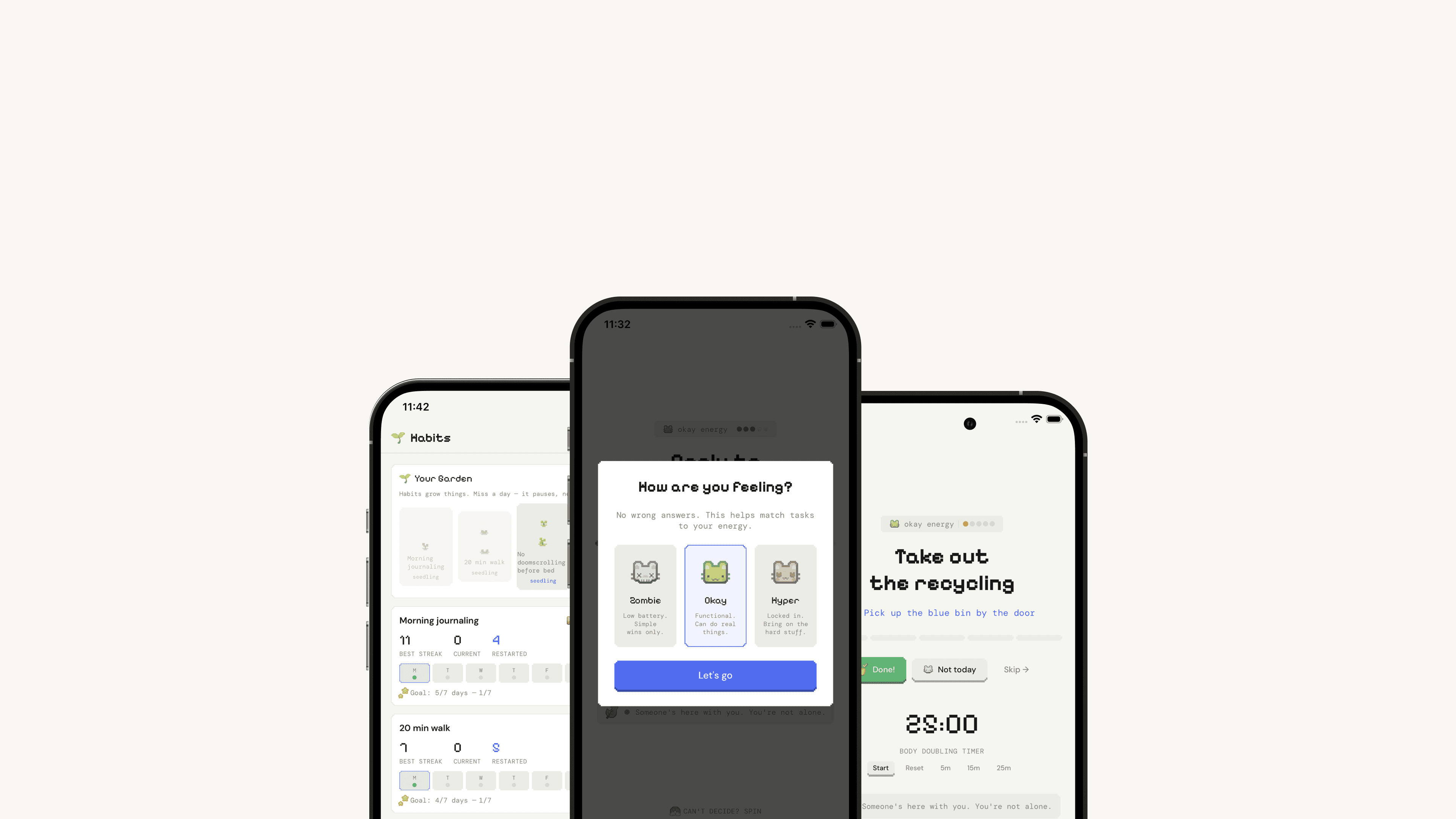
The Real Problem
I exported my Todoist account before deleting it. The file had 1,847 tasks. Roughly 1,100 were still open. I hadn't looked at most of them in over a year.
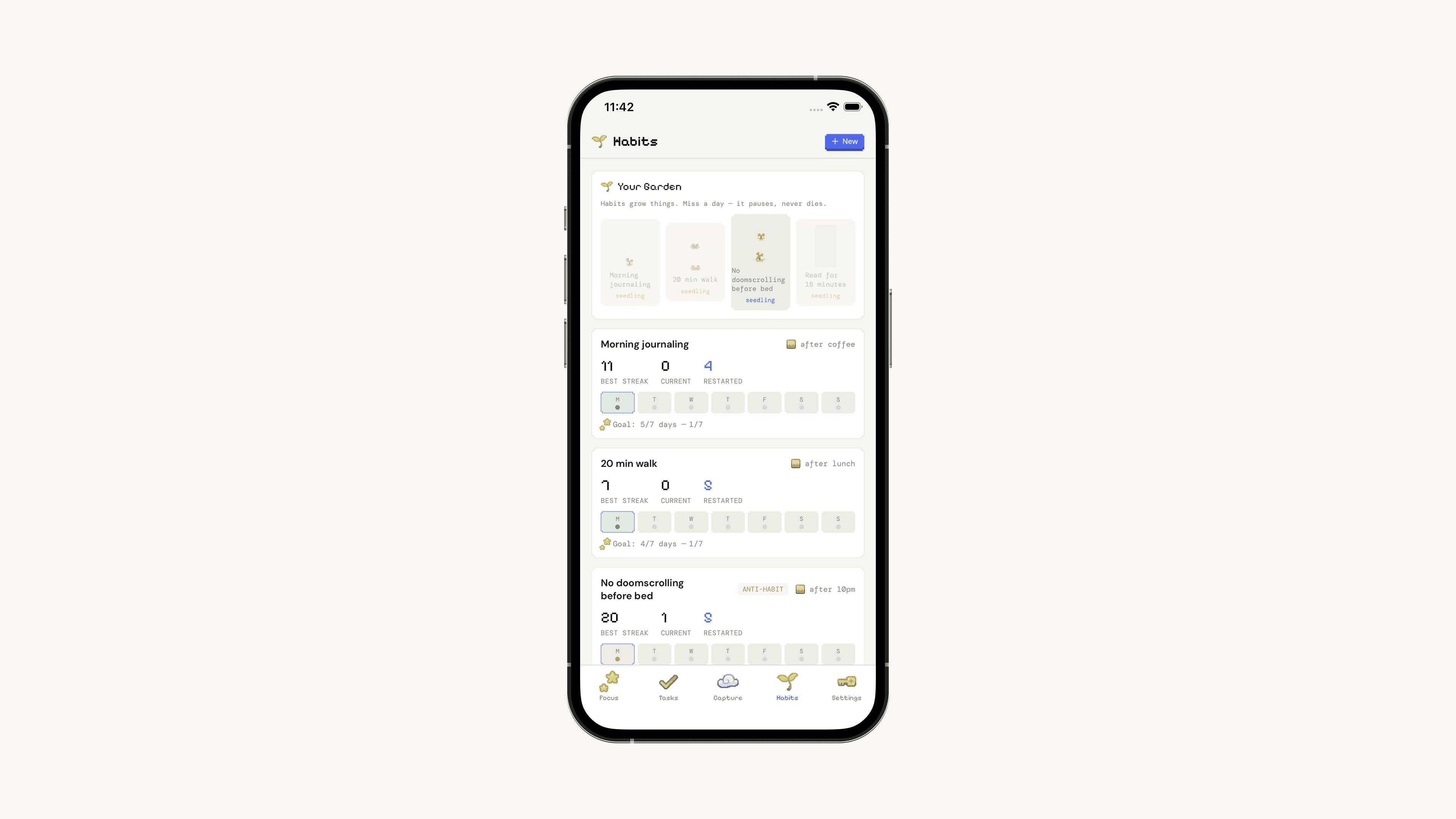
Five apps in five years, same pattern: Things 3, Todoist, TickTick, Structured, Sunsama. Each one shipped beautifully designed features that assumed I'd be functional enough to use them. Todoist once notified me I was "1 day away from breaking your 47-day productivity streak!" — I had not been productive for 47 days. I'd been checking off easy items to keep the number alive.
The category shares one architectural assumption: the app works best when the user is at their most functional. Fine for the median user. Fails ADHD brains on exactly the days they need the tool most.
Feedback kept returning to the same three problems:
"I added 47 tasks last week and did three. I just feel worse now."
"Red overdue tags make me close the app."
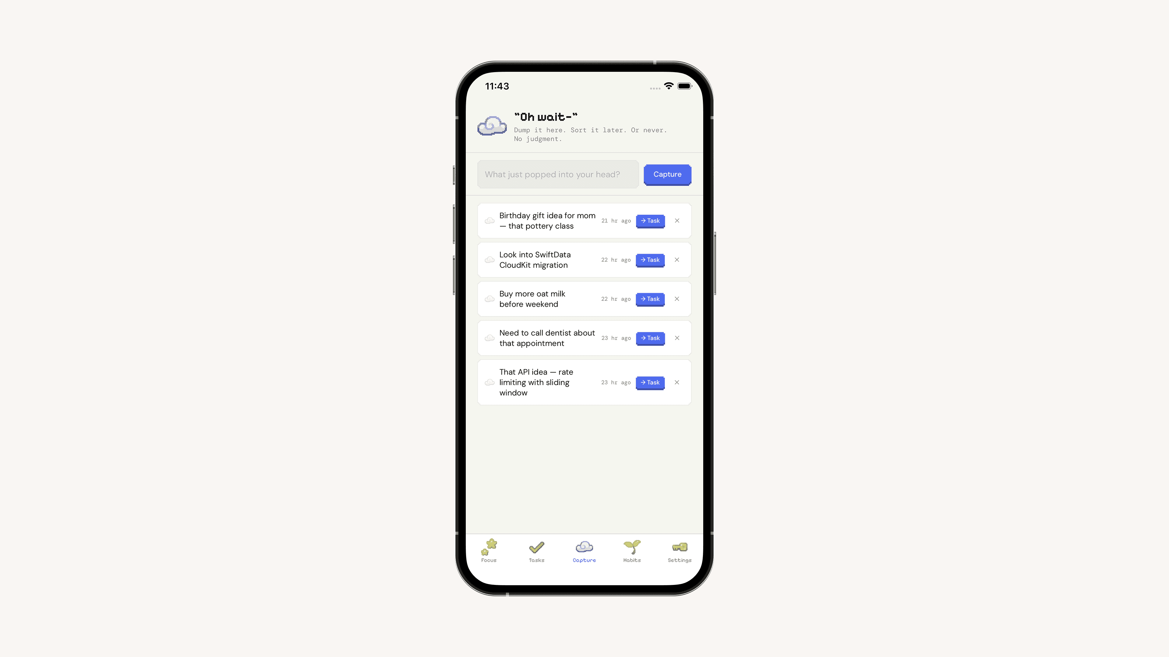
"I write tasks in a moment of clarity, then can't tell later what 'Call M re: Q2' meant."
Finding The Fix
I mapped what an ADHD brain actually does in the first three seconds of opening a list app: attention residue from the last task, visual scan of 23 items, re-triage of the day's order, moral stuck-cost on item 17, maybe a pick. That process is paid in working memory, and for ADHD users it's the dominant cost in the tool — not capture, not sync, not features.
Three architectural moves followed:
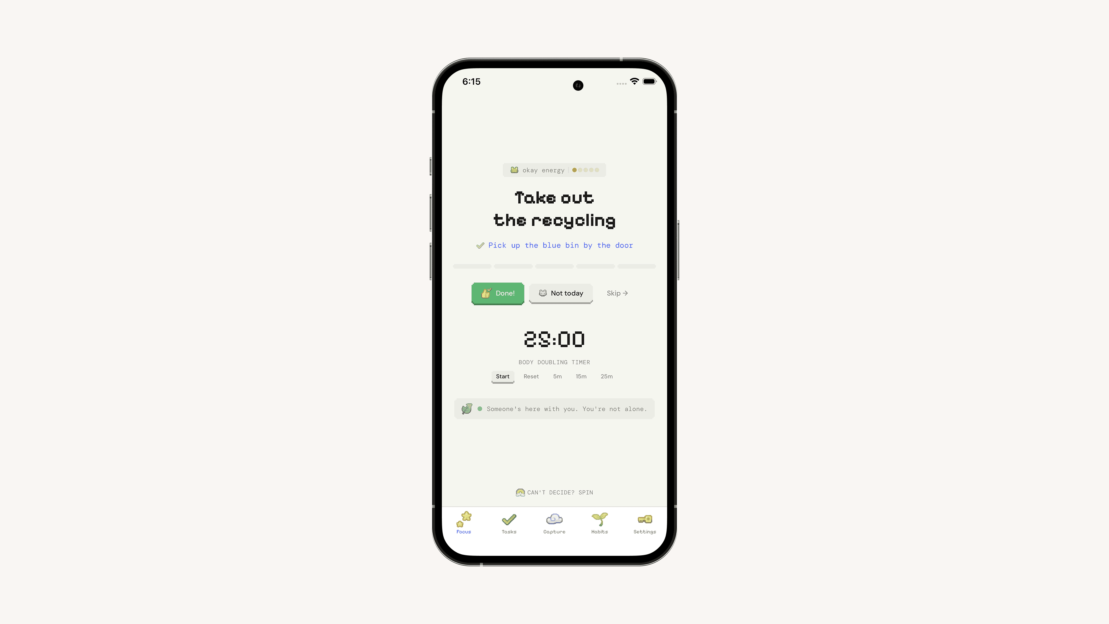
1. Focus mode as the default surface. One task on screen. Its first 2-minute step. An elapsed timer. The list is one swipe away, but not the home view.
2. A required 2-minute "door opener" field. Required, in plain language: "What's the first 2-minute action?" Not "clean the kitchen" but "open the dishwasher." The clarity-moment user is forced to leave a note for the depleted-moment user.
3. Task decay instead of overdue red. Untouched tasks fade after 21 days and archive themselves. Red "overdue" is a punishment signal; decay is information.
What Actually Happened
Three things changed during beta:
The decay threshold. Shipped with 14 days. Beta users said it felt aggressive. Moved to 21, kept it adjustable.
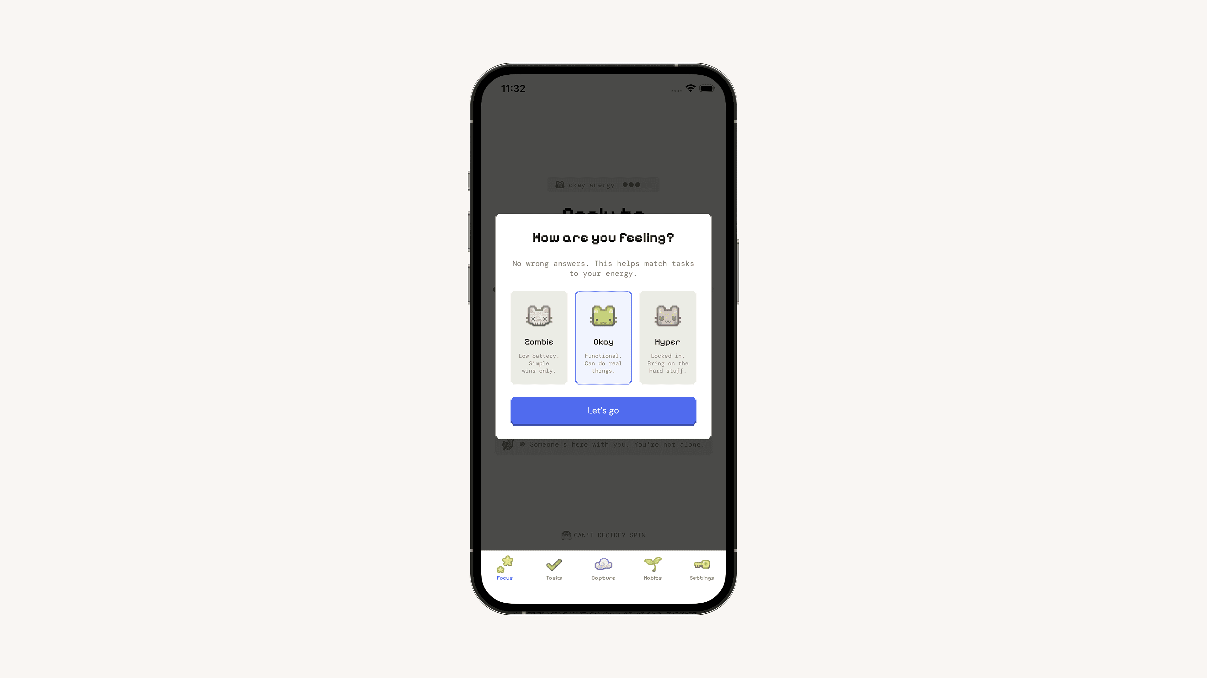
The "Snooze" button. A beta tester circled the word and wrote: "This makes me feel bad every time." I renamed it to "Not today." Same behavior underneath; the emotional weight dropped noticeably. Every user who mentioned the change used the word relief.
Energy matching. A tester said: "I'm a zombie at 3pm and the app shows me 'write quarterly report.'" That became the energy check (zombie / okay / hyperfocus). Surfaced entirely from user feedback.
What Changed
The single-task execution view is the load-bearing feature. Users report it as structurally changing how they work, not as a preference.
Task decay is the most contested and most defended feature. Users push back on day one and defend it within a month.
Language changes punched above their weight. "Not today" was a three-word change with the largest reported emotional impact of any decision I shipped.
"This is the first todo app where the empty state doesn't feel like an accusation."
What I Had to Work With
Solo build, evenings only, no design partner. Validation came from self-experimentation, beta feedback, and published research — no controlled studies.
iOS/iPadOS/macOS only. A smaller surface shipped well beats a wider one shipped thin.
Designing for myself was the strongest signal and the most dangerous trap. ADHD presents differently across users; my brain is one data point.
What I'd Do Differently
Test the decay threshold across three values in beta instead of picking one and back-pedaling.
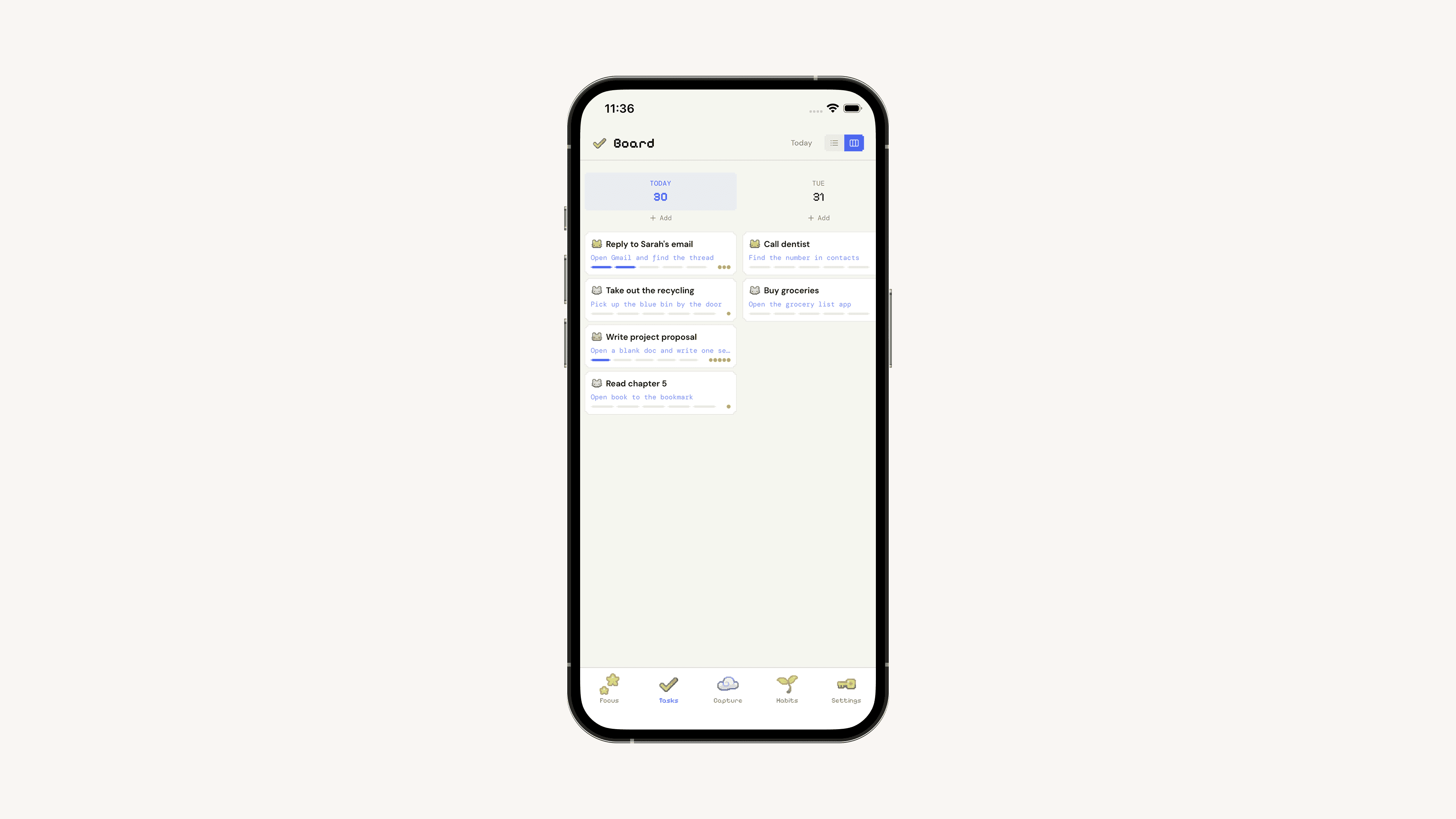
Cut the board view. It's a planning feature, and planning isn't the bottleneck.
Write the architectural argument before building. Several clarifying ideas surfaced after shipping that would have changed my feature list earlier.
What I Learned
Architecture beats features. The product is one premise — design for the bad day, not the good one — and the features are its proof.
Required fields are a design tool. Optional sub-task fields get skipped during clarity and missed during depletion. Required ones force the clarity-moment user to do a favor for the depleted-moment user.
Words are load-bearing. "Snooze" → "Not today" had more emotional impact than any UI redesign.
Serving one audience well requires failing another deliberately. Task decay would be data loss to a median user. Generic apps shouldn't ship it. That's the point.