Colorscope
Native Mac & iPad color studio
Design
Art
Role
Product Designer, Builder
Timeline
2 Months
team
me
platform
Mac, iPad
The Real Problem
I went looking for a palette I had built in Procreate eight months earlier — a set of six muted greens I'd pulled off a still from The Tale of the Princess Kaguya. I knew I'd saved it. I could not find it. It was somewhere inside a Procreate document I no longer had open, on a swatch row I had not labeled, on an iPad that had since been reset.
I asked seven working illustrators if they had the same experience. All seven did. The exact phrasing varied. The structure didn't:
"I rebuild the same palette three or four times a year. I know I had it. I just can't find it."
"I'll see a film still, pull colors, work for two days, and never see those colors again."
"My swatches are scattered across nine Procreate files, two Notes screenshots, and one screenshot of a screenshot."
The category — Procreate, Pigments, Adobe Color, Coolors — shares one architectural assumption: the palette is a byproduct of the document. It lives where the painting lives. When the document closes, the palette functionally disappears.
Fine for a designer building a brand system once. Fails illustrators, who work in a stream of short pieces and re-encounter the same color problem every four months.
Finding the Fix
I mapped what an illustrator actually does when they sit down to start a new piece: open the reference, eyedrop four or five colors, build a working palette of maybe twelve, ship the piece, close the file. Three months later the same illustrator opens a new piece in the same key — a snowy interior, a sodium-lit night street, a Studio Ghibli kitchen — and starts the eyedrop over from scratch.
The palette is not a byproduct. It is the durable artifact. The painting is the disposable one.
Three architectural moves followed:
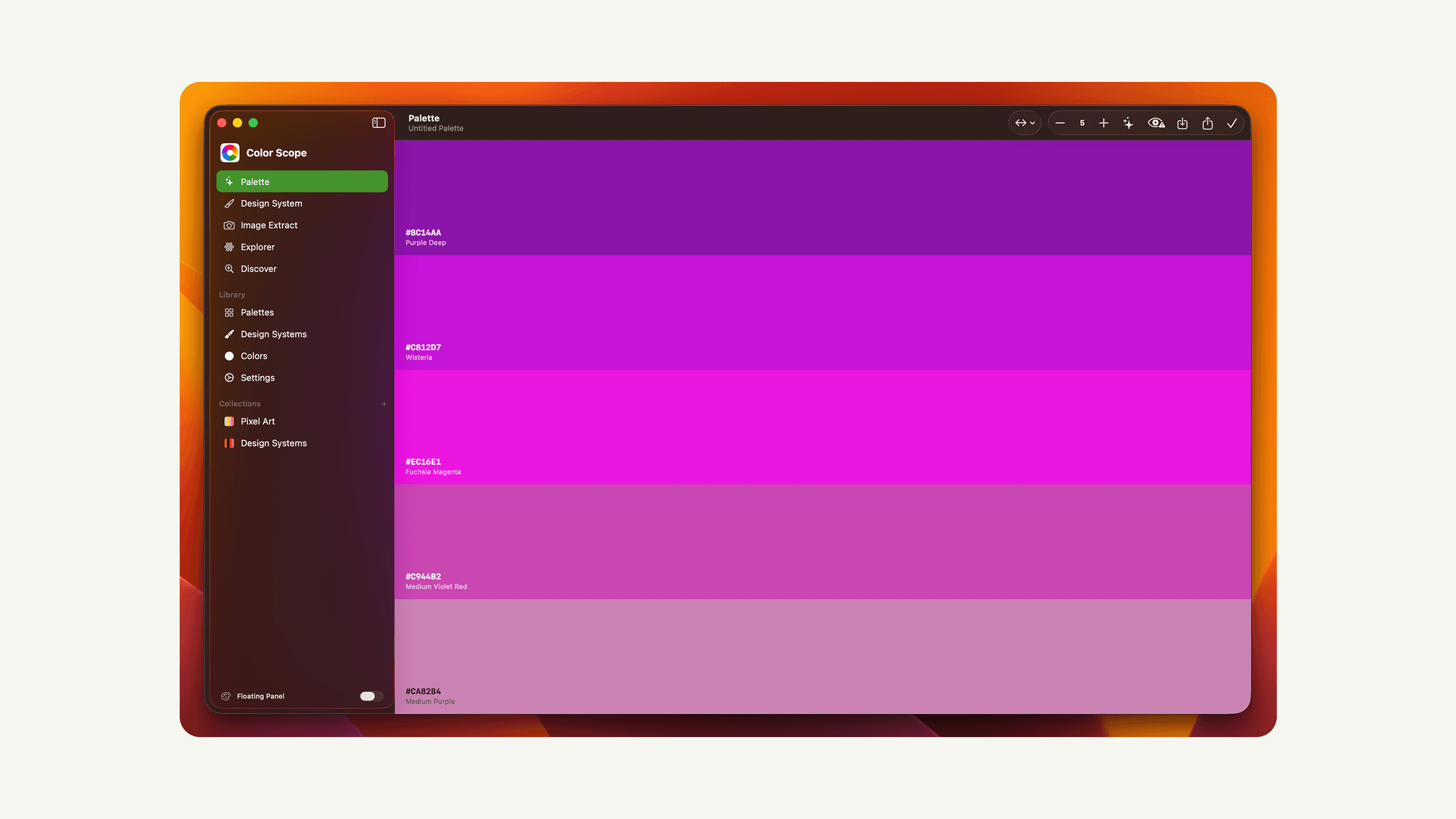
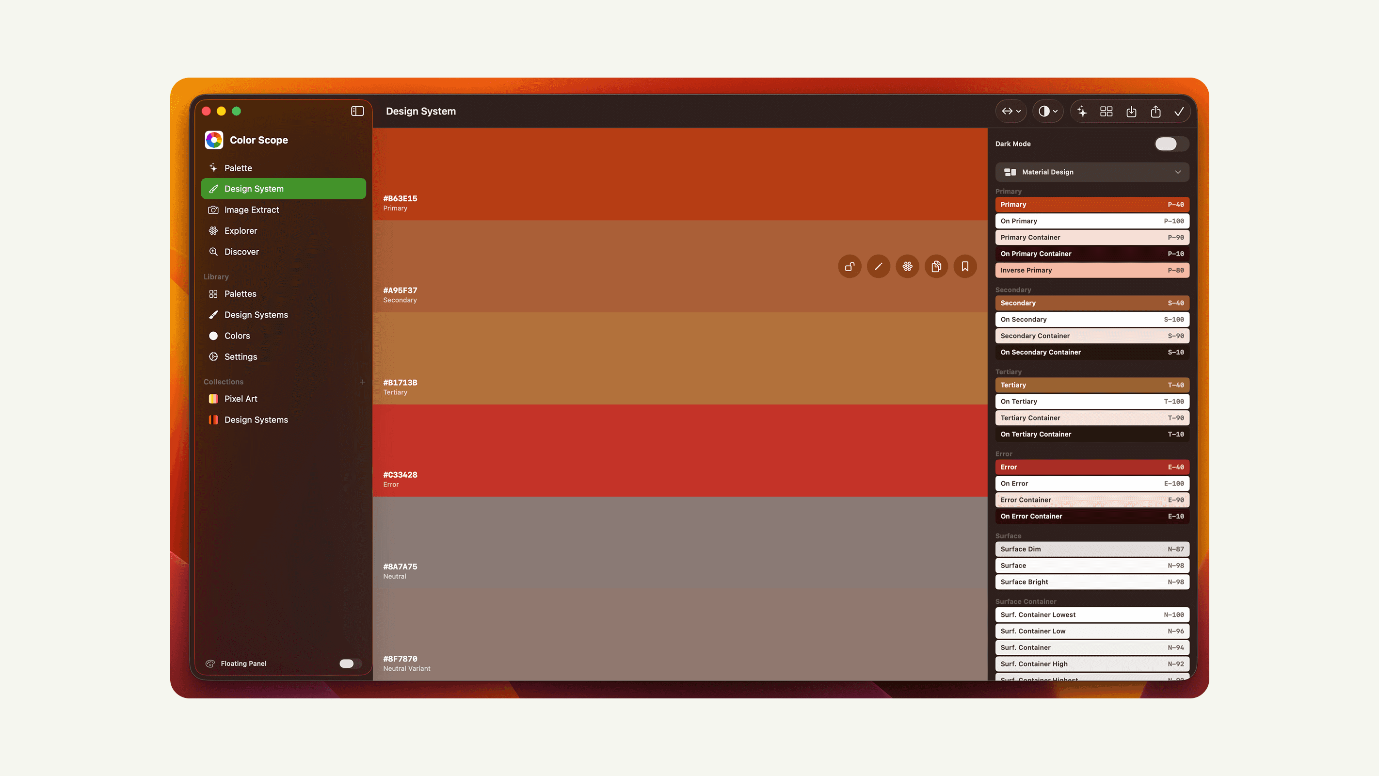
1. The palette is the document. Color Scope opens to a palette, not a canvas. Palettes are first-class objects with names, project membership, and a search index. The painting tool lives elsewhere; Color Scope is for the colors.
2. Project as the unit of memory. A palette belongs to a project. A project is the kind of work — "winter interiors," "the dog book," "client X" — not a single piece. Six months later, "winter interiors" still exists, still holds last January's nine palettes, and the colors are one tap away.
3. Swatch search across everything. Every color you've ever saved, searchable by hex, by name, by project. The illustrator who knew they had those six muted greens can type #5a6b58 and find them.
What Actually Happened
Three things changed during beta:
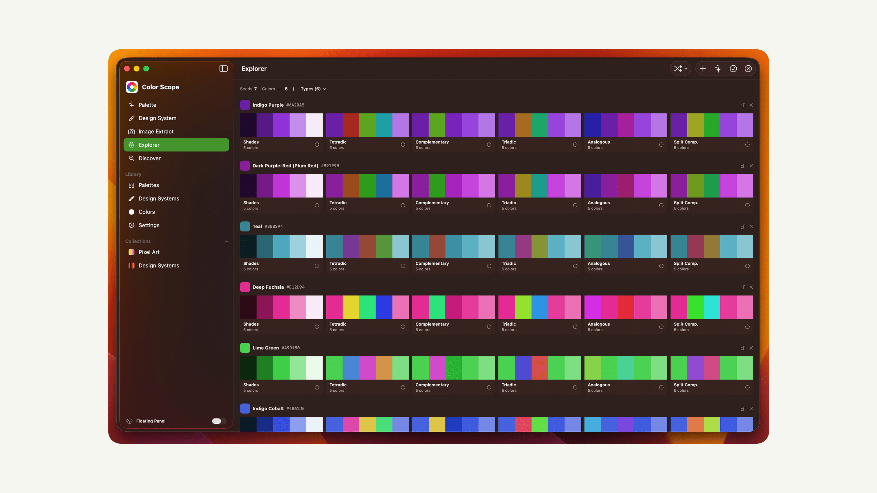
The harmony hints. I shipped a complementary/analogous/triadic dropdown on the palette builder. Beta users mostly ignored it. The one who used it heavily said: "I want it to whisper, not pick." I moved it to a small floating panel that suggests harmonies based on the swatch you have your finger on, and only when you ask. Usage went up.
The image extractor's color count. Default was eight. Illustrators kept reducing it to four or five before saving. I changed the default to five and made the count a slider that remembers per-project. The fix was three lines of code and removed the most common complaint of the first month.
Project vs. tag. I shipped tags as the organizing primitive. Two weeks in, no one used them. A tester said: "I don't want metadata. I want a folder." I rebuilt the model around projects (single membership, like a folder) and kept tags as a secondary layer for cross-cutting themes. Single-membership turned out to match how illustrators actually think about their own work.
What Changed
The palette-as-document decision is the load-bearing one. Users describe Color Scope as "the place my palettes live" — not "the app I made palettes in." That language shift was the goal.
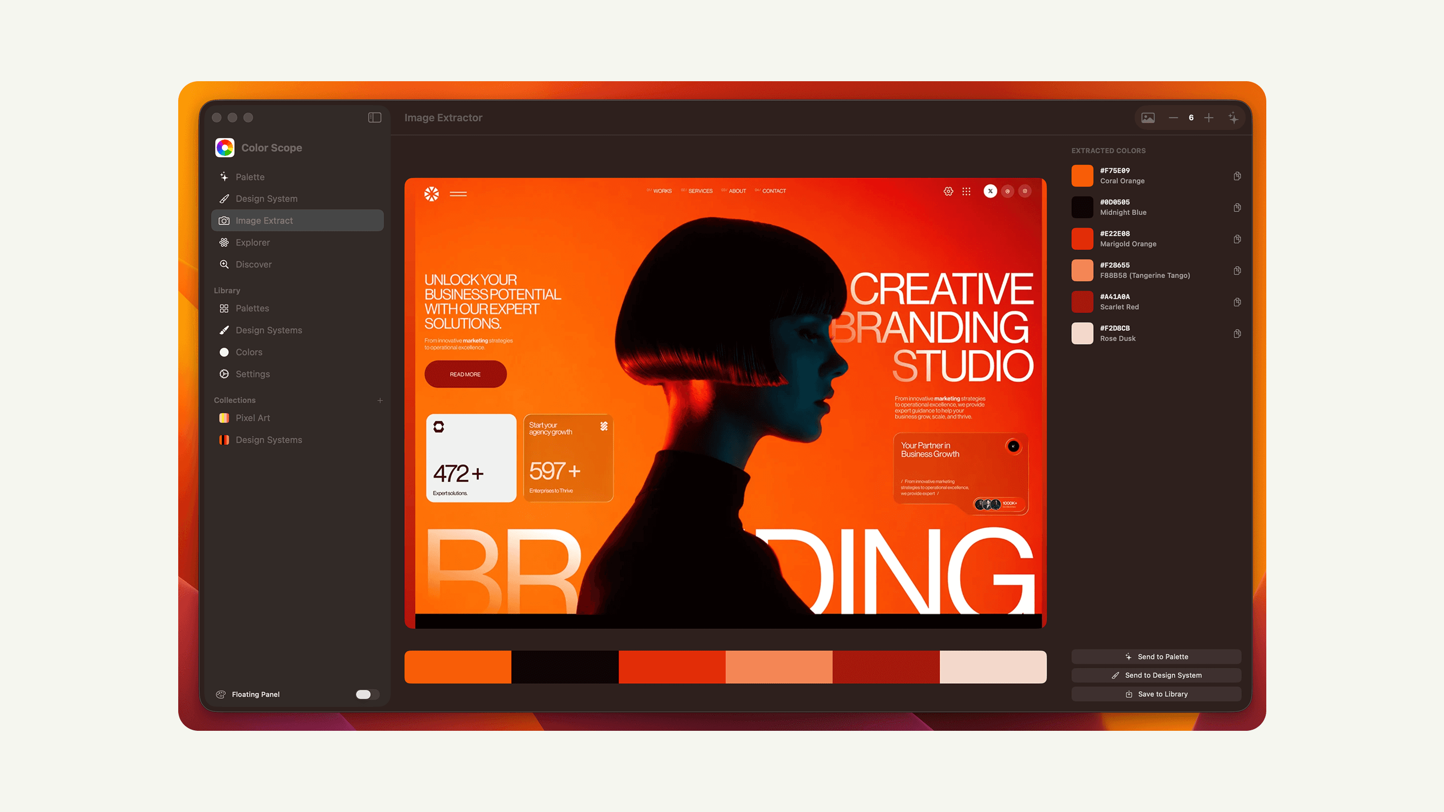
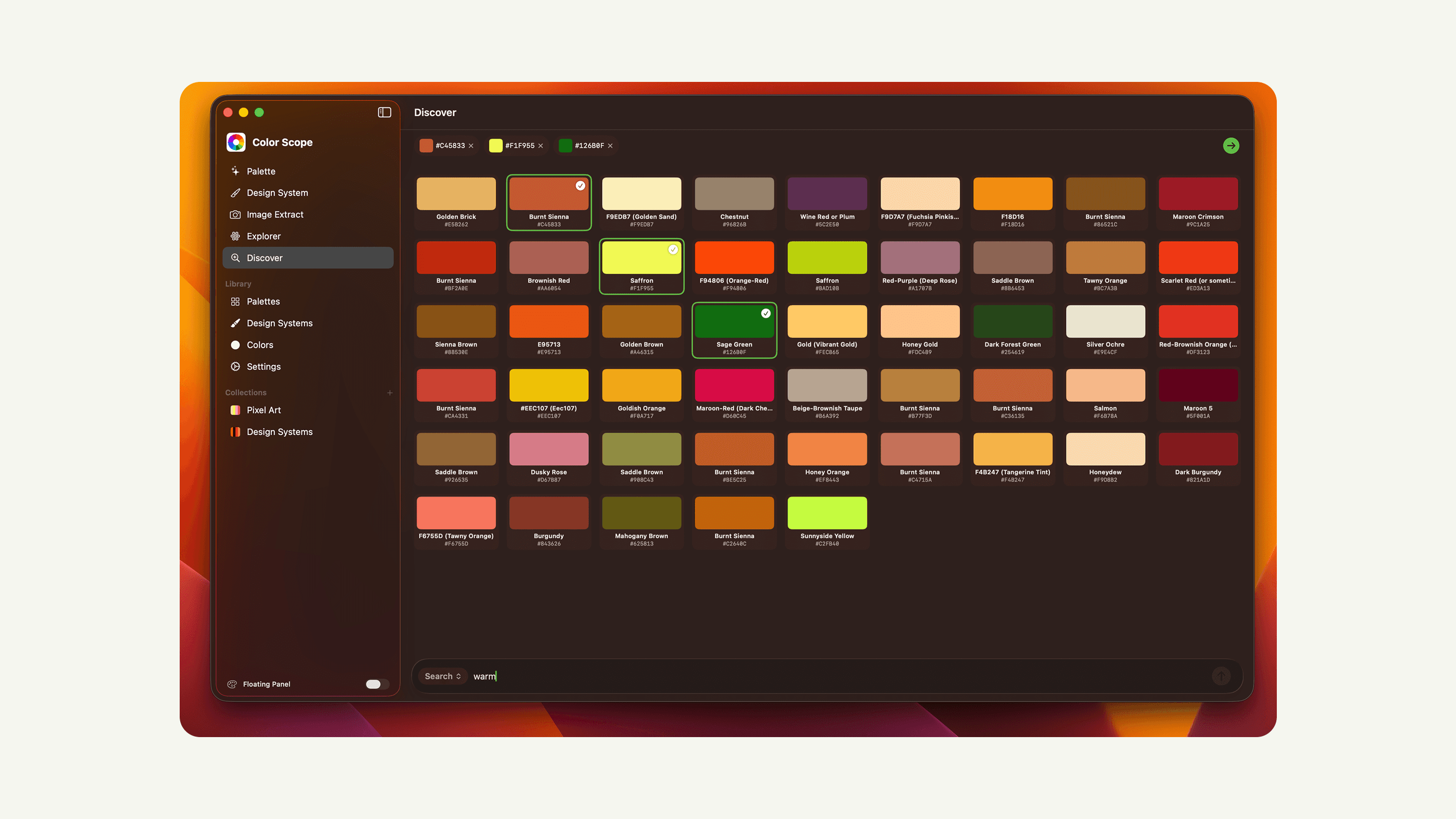
Image extraction is the most-used feature and the most-misjudged in pre-launch. I treated it as a utility; users treat it as the front door. About 60% of new palettes start from a dropped image. The pin-to-quick-access panel, which I almost cut, is the second-most-used surface.
The thing I underestimated most was naming. Letting users name a swatch ("the green from the Kaguya still," not #5A6B58) is what makes search useful six months later. A nameless hex code in March is a stranger by September.
"This is the first time I've had a palette from last year that I could actually find and use this year."
What I'd Do Differently
Ship swatch naming as a mandatory step in image extraction, not an optional one. Unnamed swatches are tomorrow's stranger. The optional field gets skipped, then regretted.
Cut the gradient tool from v1. It's elegant and almost no one uses it. Gradients are not the bottleneck; finding the colors again is.
Write the one-line product premise before building the feature list. "The palette is the document" is six words and would have killed three features earlier than they died on their own.
What I Learned
Architecture beats features. The product is one premise — the palette is the durable artifact, the painting is the disposable one — and every feature that survived to ship is a proof of it.
The default surface teaches the user what the product is for. Opening to a palette tells the user this app is about palettes. Opening to a canvas would have made it a worse Procreate.
Naming is a design surface. A swatch named "the green from the Kaguya still" is a different object than #5A6B58. The keyboard is part of the color system.
Serving illustrators well requires failing other audiences deliberately. Color Scope is not a UI design tool. It does not export Tailwind tokens. A brand designer would find it incomplete. That is the point.